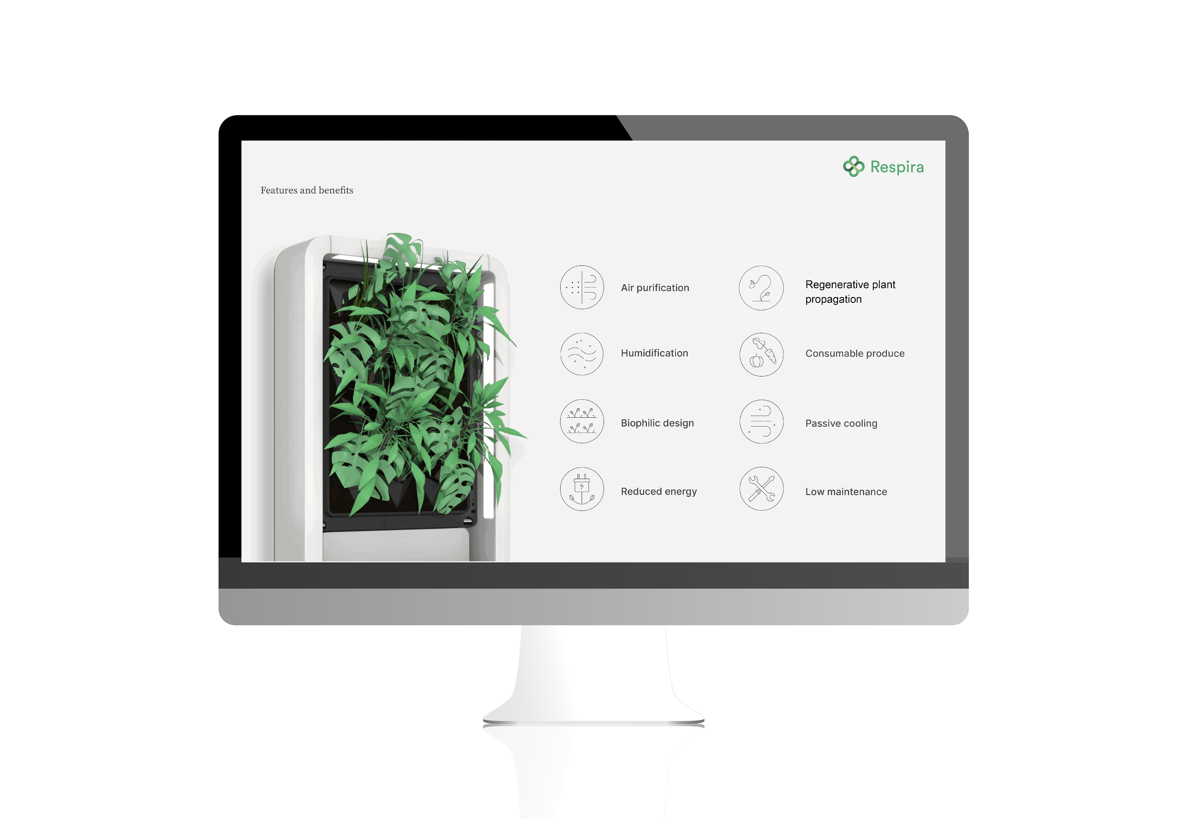


Respira is a biophilic designed wall of plants that acts as a living air filter that you can install in your home. The roots act as a natural filter to contaminated air streams. Their purpose is to enhance the experience people have in their homes through a connection to nature and improved air quality.
Respira needed a brand that made them stand out as a unique and green air filtration system. They are one of the only companies bringing green walls to the residential space, and therefore needed a communication strategy that people can welcome into their homes. The walls are simple, low maintenance, and have incredible benefits for mental health and the overall quality of life indoors. The brand had to communicate a degree of joy in the simplicity and wonder of Respira.


Respira’s brand is Clean, Lively, and Biological. The smooth and flowing gradients mimic the infinite flow of air passing through the plants. The forms are loose and inspired by the organic forms of roots and leaves. The logo is simple, sophisticated, rooted in nature, and also scientific.
The logo is designed to have a one-colour twin, that can be used on the face of the product or any collateral with production methods that don't require printing with many (if any at all) inks.

Using Respira's brand, I also developed digital marketing resources. In sticking with the simple brand, icons were developed to aid in communicating features.
By keeping that material online, they were able to reduce their need for printed collateral. Meaning less paper, less inks, and less future waste.